By Peter McKenzie-Brown
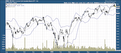
In this chart I have stripped away everything except the
candlesticks showing daily trades, trading volume, and Bollinger Bands.
Before I explain why this is significant, let me offer you
the caution that the underlying asset here – an ETF covering calls on the
Canadian banks – is risky, and fees can be high. To understand the risks,
please click on the attachment.
Bollinger Bands consist of a centre line and two price
channels (bands) above and below it. The centre line is an exponential moving
average; the price channels are standard deviations of the stock under study.
The bands expand and contract as the price action of an issue becomes volatile
(expansion) or becomes bound into a tight trading pattern (contraction).
In the 1980s, John Bollinger, a long-time market technician,
developed the technique of using a moving average with two trading bands above
and below it. Unlike a percentage calculation from a normal moving average,
Bollinger Bands simply add and subtract a standard deviation calculation –
essentially, a mathematical formula that measures volatility, showing how the
stock price can vary from its “true value.” In 2001 he published an excellent
book on the system, titled Bollinger on
Bollinger Bands. You can download it as a PDF here.
Bollinger considers his eponymous instrument as the primary
tool in a system he calls “rational analysis.” That system, he says, combines “technical
analysis and fundamental analysis in a relative framework.”
By measuring price volatility, Bollinger Bands adjust
themselves to market conditions. This is what makes them so handy for traders:
they can organize relevant price data between two bands in such a way that they
give you a sense of when to sell, and when to buy. Selling when the asset is
close to the top band makes sense. Similarly, if you like an asset, you should
buy when it’s close to the bottom.
Of course, nothing in this note
in any way constitutes a buy-or-sell recommendation.

No comments:
Post a Comment